What the Rebranding Process Actually Requires
Words Leigh Banks
Rebranding is not a creative exercise. It is a business investment with a creative dimension. Done in the right sequence, with the right commitment at each phase, it produces brands that earn pricing power, create real distinction, and compound in value over time.
Most rebrands are lost in the first meeting.
Not the first creative presentation. The first meeting, the one where the brief gets talked through, the timeline is signed off, and someone asks, “Can we skip the strategy phase and go straight to design? We know who we are. We just need a fresh look.”
That decision, and how quickly it tends to be made, explains why so many rebrands deliver beautiful work that does nothing. The new identity is handsome. The website is tidier. The business cards impress. Yet six months on, nothing has shifted commercially. The brief asked for transformation and got decoration, because the process was upside down from the outset.
A rebrand is not a creative exercise. It is a strategic one that happens to have a creative output. The sequence is not red tape; it is the very thing that turns the spend into a return. Grasp the sequence and stick to it, and a rebrand can change how a whole market thinks about a business. Cut corners on it, and you are paying serious money for an aesthetic refresh that fixes nothing.
Here is what the process genuinely demands.
First, A Word On Terminology
Before any of this, it is worth being precise about a word that gets used far too loosely. Rebrand, brand evolution, brand refresh, brand renovation, they are spoken almost interchangeably, and they are not the same thing. The confusion matters, because choosing the wrong one is how businesses talk themselves into far more risk than the situation calls for
A rebrand is the most revolutionary act available to a business. It is a deliberate break with what came before, and it puts years of hard-earned equity on the table. Recognition, trust, the associations a market has slowly built up around a name: a true rebrand risks losing all of it in pursuit of something new. There are moments that justify that risk, a fundamental change in what the business does, a merger that has to be made coherent, a reputation that genuinely needs leaving behind, a positioning that no longer has any truth in it. But those moments are rare. A rebrand is the option of last resort, reserved for the most intense situations, not the default response to a brand that feels a little tired.
For most businesses, the honest answer lies somewhere short of revolution. Brand evolution, brand refresh, and brand renovation are each subtly different, and one of them is almost certainly where you need to be focusing. A refresh tends to mean modernising the existing identity while keeping it recognisably itself. A renovation goes deeper, rebuilding parts of the system that no longer work while preserving the equity that does. An evolution describes the longer arc, the steady, deliberate movement of a brand to keep pace with the business and the market without ever snapping the thread of recognition. None of these throws away what has been earned. All of them build on it.
The discipline that follows applies to whichever of these you are doing. The depth changes; the sequence does not. So the first question is not how the new brand should look. It is which of these words actually describes the work in front of you, because getting that wrong is the most expensive mistake of all, and it is made before the project even begins. A word on usage from here on: for readability this article uses “rebrand” as shorthand for that whole family of work, from a full revolution down to a careful evolution. The distinction above still governs the one thing that matters most, how far you should be taking it.
The Work That Has to Come First
Rebranding starts not with making things but with understanding them. Discovery is the phase clients are most impatient with, and the one agencies most readily let shrink, because it shows no visible output and offers no creative thrill. It is also the phase that sets the quality of everything afterwards.
Discovery means seeing the business from the outside in. Conversations with current customers that move past satisfaction surveys into an honest exploration of what they take the brand to be, what they would miss were it gone, and what feels slightly off about it. Conversations with prospects who picked a competitor and can say why. Clear-eyed competitive analysis that maps not only what rivals say but what ground they have actually taken in the minds of category buyers.
It also means seeing the business from the inside out. Leadership interviews that reveal whether the executive team really agrees on what the brand stands for, because, more often than not, it does not. Employee conversations that expose the distance between what the brand claims externally and what the people delivering it believe internally. A methodical audit of every customer touchpoint: website, sales collateral, physical spaces, service interactions.
When Spinach started the Cowshed project, two decades had gone by since the brand was founded inside Soho House. The brief called for modernisation. Discovery uncovered something more precise. The brand had moved on considerably across those twenty years, but its identity had not kept up. This was evolution rather than revolution, there was real equity to protect, not to break from, and the work was about closing the gap between what the brand had become and what it still looked like. The positioning that came out of it, Understated Indulgence, was not dreamt up in a workshop. It was surfaced by listening to the people closest to the brand describe what it had always truly been. Discovery did not hand us a direction; it handed us a truth. Creative work then turned that truth into a visual language, with botanical illustrator Katie Scott giving the positioning an identity specific enough to be owned.
For a focused rebrand, discovery usually takes two to three weeks, and longer for organisations with complicated structures or several audience groups. The output is a document that tells the brand what it actually is, rather than what it imagines itself to be. That document is the bedrock for all that follows.


Photography copyright ©Soho House, Katie Scott
“The most expensive rebrand is the one that answers the wrong question beautifully. Pouring money into a new visual identity for a brand that does not know what it stands for buys a more elegant version of the same confusion.”
Strategy Before a Single Design
Once discovery is done, the strategy phase converts insight into direction. This is where the decisions get made that design will later give form to. It is also where the most important conversations take place, because strategy calls for choices that rule things out, and organisations find ruling things out uncomfortable.
Brand positioning is the core output here: a clear statement of the particular territory the brand will hold in the minds of the people it most needs to reach. Not a vision statement. Not a list of values. A precise answer to the question: for whom, in what category, offering what difference, backed by what evidence? Every word in a positioning statement is either doing commercial work or has no business being there.
Beyond positioning, the strategy phase fixes the verbal identity: the tone of voice, the language patterns, and the specific claims the brand will and will not make. It also fixes brand architecture, the structural logic for how a portfolio of products, services, or sub-brands relates to one another and to the masterbrand. Architecture choices taken here decide how much complexity, or simplicity, the design system will have to carry.
This phase usually runs four to five weeks, taking in workshops with senior leadership and several rounds of iteration. If an agency offers to squeeze or skip it so the team can get into creative development sooner, that is not efficiency. It is the surest sign of a rebrand that will need redoing inside three years.
When Spinach repositioned Knight Frank, the strategy phase threw up a diagnostic that shaped the creative work at a fundamental level. This sat at the other end of the spectrum from Cowshed: a genuine repositioning, the kind of revolutionary move that earns the word rebrand in its strict sense. Empty interiors had ruled the brand’s visual language for years. The research insight was exact: buyers are not purchasing square footage; they are purchasing a life. Moving from property-led to people-led communication was a deliberate decision taken before a single image was art-directed. Design could only voice it because strategy had named it first.
The failure mode I have seen most often is not a poor brief or a thin strategy. It is a board that commissions the work and then vanishes from it.
A large professional services firm engaged Spinach some years back. The senior executives turned up to the commissioning meeting in full. They were generous with their time, clear about their ambitions, and warm about the brief. Then they passed us to the marketing team and said: go and run the workshops, get the creative work going, and report back once you have something to show us.
What we presented was rejected. Not once. Routinely.
This is not rare. It happens far more often than the industry will admit, and it is wholly predictable once you see the mechanism. The executives with the authority to sign off the brand were not present for the conversations that shaped it. They did not sit in the workshops where the positioning choices were made. They were not in the room when the competitive territory was mapped, or when the founding tensions in the brief were settled. So when the work landed, it felt like somebody else’s reading of their business, because it had been built without them. Their instinct was to reject it – and their instinct was sound.
The lesson is structural. A rebrand commissioned by the board has to be worked on with the board, not unveiled to them at the finish. The executives who will eventually approve or reject the positioning need to be part of the process that creates it. Not in every workshop. Not reviewing every creative iteration. But there are moments when the big strategic choices are made, so that what emerges reads as an expression of their own thinking rather than a pitch arriving from outside.
Alignment is not a soft requirement. It is the condition that decides whether the work survives contact with the organisation that paid for it.
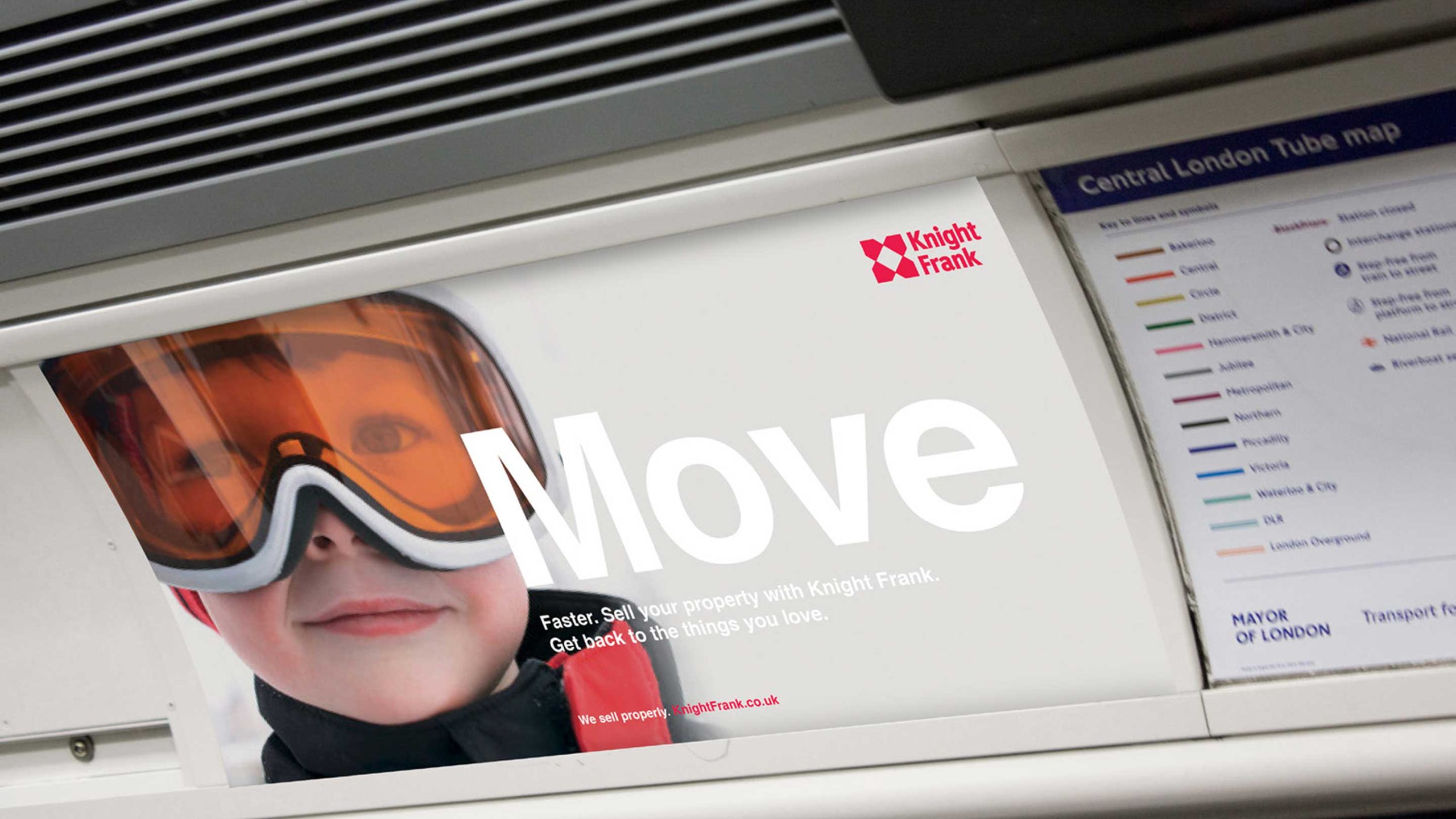

Photography copyright ©Knight Frank
Creative Development: Translation, Not Invention
When strategy is properly locked, creative development becomes a different sort of task. The designers are not inventing a brand. They are translating an argument into a visual and verbal language. The brief has real substance. The creative choices have a yardstick against which they can be measured: does this express the strategy?
Creative development usually opens with two or three distinct strategic directions, each voicing the same positioning through a different creative approach. The point is not to lay out options to pick by preference, but to test different translations of the same truth before settling on one. The choice is strategic, not aesthetic: which direction most exactly expresses what the strategy needs?
From the chosen direction, the full creative system is built out: logo, colour palette, typography, photographic style, graphic language, and iconography. Verbal identity assets are developed alongside: taglines, naming conventions, and tone-of-voice guidelines, with worked examples rather than abstract description.
The Campari rebrand produced Bitter Sans, a bespoke typeface designed to carry the brand’s character across every global execution, market, and language. A single owned typographic asset that needs no interpretation and triggers instant recognition whatever the context. Its brief was strategic, not aesthetic. It had to hold the cultural weight of Milanese sophistication and the confidence that comes with bitterness as a mark of taste. The design solved a strategic problem.
This phase usually runs six to eight weeks, covering concept presentation, direction selection, and two to three rounds of refinement. The output is a complete brand identity system plus a brand guidelines document precise enough to be applied consistently by people who were nowhere near the decisions when they were made.
The Phase Nobody Budgets For
Implementation planning is the phase most clients undervalue and most budgets under-fund. It is also the phase that decides whether the strategic and creative investment yields a brand customers actually meet, or a brand that lives only in guidelines documents and approved files while the old identity carries on representing the business out in the world.
What most clients underestimate about implementation is its internal side. There is a stubborn assumption that, once the new brand exists, it will somehow spread itself through the organisation. It will not.
What is the use of a new brand if the CEO cannot explain what it stands for, the finance team is still sending proposals in the old identity, and the person picking up the phone on launch day has never been told what changed or why? One of the chief jobs of a rebrand is to get an entire organisation telling the same story. Not just the marketing team. Everyone who touches a customer, a supplier, a candidate, a journalist, a partner. The brand is not what the guidelines say it is. It is what every one of those people conveys in every interaction, whether they realise it or not.
Internal launch is not a soft deliverable. It is a commercial one. Organisations that treat it as an afterthought find out it was actually the whole point.
A professional implementation plan opens with a full touchpoint inventory: every context where the brand appears or might appear, from the website and social channels to sales collateral, physical environments, packaging, email signatures, vehicle livery, uniforms, and internal communications. Each touchpoint needs its own brief, its own timeline, and its own resource, whether internal or external.
The implementation phase also tackles governance: the systems and responsibilities that will keep the new brand applied consistently once the agency has finished. A brand without governance decays. The Berkeley Group Digital Brand Hub is the clearest case in Spinach’s portfolio of brand governance working at scale. Before the Hub existed, 30% of design revisions traced back to inconsistent asset management. The fix was structural: real-time access to approved assets for every team in every market, removing the conditions that breed inconsistency rather than leaning on compliance to keep it out.
Implementation typically means four to five weeks of planning, then a launch period whose length depends on the scope of the rebrand and the complexity of the organisation. A realistic full implementation timeline for a mid-size business with multiple touchpoints runs three to four months after creative approval.

Campari Bitter Sans typeface
Launch Is Not a Migration
Some clients choose to launch their new brand quietly. No announcement, no campaign, no moment. The new identity goes up on the website, the old materials are swapped out bit by bit, and the change is handled as an internal matter rather than a public one. The reasoning is usually caution: not wanting to overclaim, not wanting to invite scrutiny, not wanting the launch to feel like a gamble.
This is a serious commercial mistake.
There are very few moments in a business’s life when it holds a genuine story to tell, an audience willing to receive it, and the conditions for earned media attention that costs nothing. A well-handled rebrand is one of them. The new positioning, the reason for the change, the vision for what the brand is becoming: these are precisely the ingredients journalists, industry commentators, and would-be customers find genuinely interesting, exactly because most brands never change and the few that do rarely explain themselves with clarity and confidence.
The brands that treat launch as a moment rather than a migration seize something that cannot be bought back later. Goodwill, attention, and the narrative edge of being the brand that made a bold, explained choice. That window does not stay open. Use it.
After launch, the first 90 days call for active monitoring of brand consistency across touchpoints, of customer and stakeholder reactions, and of internal adoption. The problems that surface in this stretch are nearly always implementation problems rather than strategic ones, and dealing with them fast heads off the fragmentation that compounds over time into a brand nobody can quite describe.
The Budget Conversation Worth Having
The budget question comes up early in almost every rebrand conversation, and the prospective client’s answer is almost always one of two: we do not know yet, or we want to compare quotes before we commit to a number.
Both answers are understandable. Neither is much help. When Spinach asks about the budget, the aim is not to set the fee. It is to understand what the client has available, so the work can be shaped around hitting the project’s objectives as effectively as possible inside that reality. A client who is candid about budget lets the agency help them prioritise: what must happen, what should happen, and what can come later. A client who holds it back pushes both sides into a guessing game that rarely lands on the best outcome for either.
The best clients grasp this by instinct. They share what they have, set out what they are trying to achieve, and trust the agency to build a programme that delivers the most important things first. That conversation produces better work than any competitive pitch process, because it begins with honesty rather than posturing.
A comprehensive rebranding programme for a mid-size London business, covering discovery, strategy, creative development, and implementation planning, usually runs three to five months from start to launch. Investment ranges with scope and complexity. A focused rebrand for a single brand, covering strategy and visual identity with guidelines and implementation planning, usually falls between twenty-five and sixty thousand pounds. Larger organisations with multiple divisions, complex brand architecture, or substantial implementation scope should budget for more. These figures exclude website redevelopment, large-scale print production, environmental design, and advertising, each of which carries its own budget.
The hidden cost most organisations fail to plan for is internal time. The discovery and strategy phases demand significant leadership involvement: interviews, workshops, review sessions, decision-making. A rebrand with leadership engaged throughout produces a strategy the organisation owns and will defend. A rebrand run at arm’s length produces a strategy the organisation tolerates until someone decides to change it.


Photography copyright ©Spinach Branding, Soho House
The Question Worth Asking Before You Start
Before commissioning a rebrand, one question is worth sitting with honestly: is the problem strategic, creative, or both?
A business with genuinely unclear positioning, one that cannot say precisely who it serves, what it offers that alternatives cannot, and why that claim holds up, needs strategy first and creative work second; this is the end of the spectrum where revolution may genuinely be warranted. A business with clear positioning but a visual identity that no longer expresses it, or that has outgrown the identity it launched with, may need creative development on a lighter strategic foundation, the refresh-to-evolution end, where the equity is sound and the work is about expression rather than reinvention.
The most expensive rebrand is the one that answers the wrong question beautifully. Pouring money into a new visual identity for a brand that does not know what it stands for buys a more elegant version of the same confusion. Discovery and strategy exist to make sure the creative work that follows is solving the right problem.
Rebranding is not a creative exercise. It is a business investment with a creative dimension. Done in the right sequence, with the right commitment at each phase, it produces brands that earn pricing power, create real distinction, and compound in value over time.
Treated as a logo project, it produces a logo.

Photography copyright ©Spinach Branding