Creating a proprietary typeface to cement an icon’s visual legacy

Campari

Campari is more than a drink; it is an emblem of Milanese culture, a visual icon rooted in over 160 years of artistic patronage. From Fortunato Depero’s Futurist posters to contemporary collaborations, the brand’s visual language has always been as distinctive as its bitter-sweet taste. The unmistakable red, the confident wordmark, the aperitivo ritual – these elements have made Campari one of the world’s most recognisable drinks brands.

The Challenge

Campari’s existing brand typography, whilst elegant, presented three fundamental limitations:

Distinctiveness: As a licensed font available to any brand, its typography could never be uniquely Campari. In a category where competitors increasingly invest in ownable visual assets, this represented a strategic vulnerability.

Heritage connection: The font bore no intrinsic relationship to Campari’s rich typographic history, hand-painted signage, Futurist lettering, or the distinctive proportions that had defined the brand’s visual character across generations.

Global scalability: As Campari expanded across markets and languages, the brand needed a typographic system that performed consistently across Latin, Cyrillic, and extended character sets.

The brief was clear: create a proprietary typeface that Campari would own outright, one that connected authentically to the brand’s visual heritage whilst delivering the technical precision required for global deployment across every conceivable format – from digital to print, headlines and body copy, and in English and beyond.

Before a single letterform was drawn, we immersed ourselves in Campari’s world. We spent time in Milan, visited Galleria Campari, and worked closely with the brand team to mine the archives, studying over a century of typography across advertising, packaging, and signage.

What emerged was a revelation: Campari’s visual history contained a remarkably consistent, if uncodified, typographic DNA. From early 20th-century posters to mid-century advertisements, certain characteristics recurred:

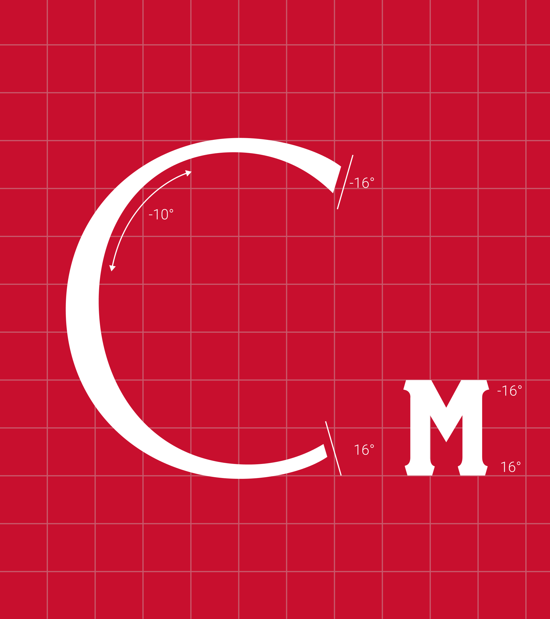
The distinctive top-heavy ‘C’, a proportion unique to Campari’s lettering, appears across decades of brand materials. The angled finials on letters like C, G, E, and S are subtle echoes of the CAMPARI logo’s slab serifs. The characteristic diagonal stroke of the ‘M’ mirrors the iconic tilt found in the brand’s wordmark. The confident, high-contrast strokes that conveyed both sophistication and visual rhythm.

This wasn’t just about inventing something new. It was about excavating what had always been there, the typographic essence of Campari, and translating it into a contemporary, systematised typeface.

Crafting a proprietary typeface is equal parts art and science. The typeface had to ladder back to Campari’s core brand proposition and identity pillars; there had to be an emotional connection to Campari’s world, culture, heritage, and artistic legacy.

We developed a guiding concept rooted in what we termed ‘Milanese Modernity’, the idea that Campari’s typography should feel at once timeless and contemporary, confident and refined, distinctly Italian yet globally fluent. This concept would underpin every design decision.

The development process moved through several phases. First, extensive discovery: archival research, stakeholder workshops, and cultural immersion in Milan. Then, creative sprints: mood boards, conceptual routes, and initial letterform sketches exploring how historical references could inform contemporary type design. Finally, technical development: working with specialist type craftspeople to develop complete character sets, multiple weights, and comprehensive language support.

Throughout, we validated decisions against both aesthetic criteria and the behavioural science of typography, legibility at scale, optical balance, and the subtle psychological cues that different letterforms communicate.

The result is Campari Bitter Sans, a bespoke sans-serif typeface that exudes sophistication whilst maintaining versatility for contemporary applications. Every detail connects to Campari’s visual heritage:

The top-heavy ‘C’: A direct homage to CAMPARI’s historic design language, inspired by the unique proportions found across various Campari assets through the decades.

Angled finials: On letters such as C, G, E, and S, these subtly echo the geometry of the CAMPARI logo’s slab serifs.

The diagonal ‘M’: The stroke mirrors the characteristic tilt found in the brand’s iconic letterform.

High-contrast strokes: Delivering a confident and consistent visual rhythm that feels premium without sacrificing legibility.

Campari Bitter Sans comprises four weights, Regular, Bold, Italic, and Bold Italic,  providing the flexibility required for diverse applications. The typeface system includes:

Full uppercase and lowercase character sets. Numerals and comprehensive punctuation. Extended Latin characters for global deployment. Clear usage guidelines specifying typographic hierarchy: Campari Bitter Sans Caps for headings, sentence case for subheadings, with Roboto Light and Regular for supporting body text.

The typeface was registered and trademarked as Campari Bitter Sans, a proprietary asset that Campari now owns outright, requiring no licensing and available exclusively to the brand.

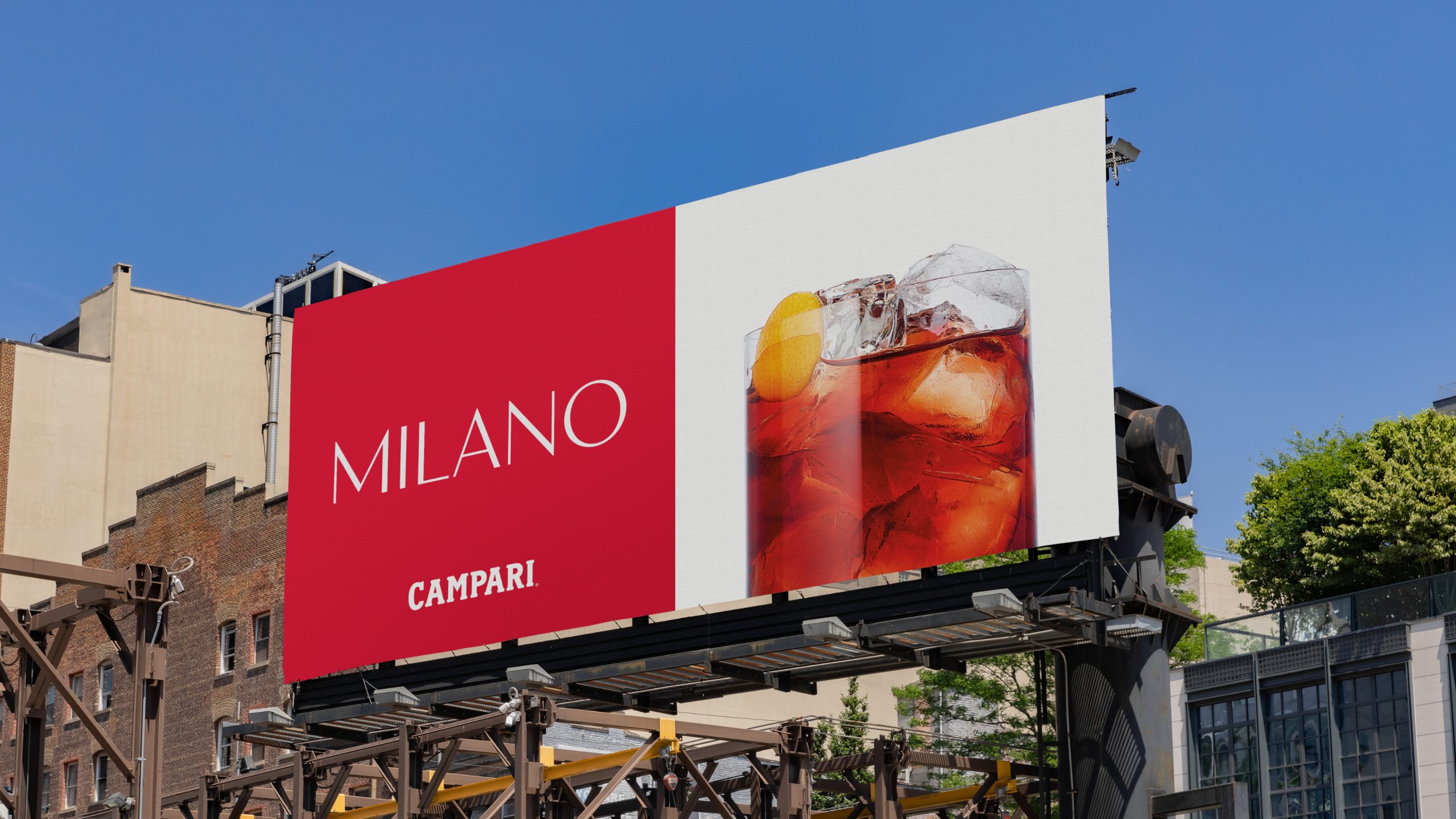
Campari Bitter Sans is now being rolled out globally across the Campari brand ecosystem, from advertising campaigns to point-of-sale materials, from digital platforms to on-trade activations. The typeface joins an exclusive cohort: the world’s most iconic brands that have invested in proprietary typography to cement their visual distinctiveness.

100%

Brand ownership

4

Weights developed

Global

Deployment scale

“The world’s best global iconic brands understand the need to have their own original, distinctive assets to maintain their heritage. With Campari Bitter Sans, we’ve created a typeface that will become part of the brand’s visual legacy for generations.” — Leigh Banks, Co-Founder, Spinach Branding

Typography Design By London Branding and Design Agency Spinach
Campari Bitter Sans - New Iconic Typography Design

Typography is often an overlooked element of brand identity, yet it is encountered more frequently than any logo, colour or image. For heritage brands operating at a global scale, a proprietary typeface is not a luxury but a strategic asset that protects distinctiveness, honours legacy, and delivers consistency that licensed fonts can never achieve.